Nice! Those improvements made it much better! I really appreciate your work on this! ![]() Everything works great, the only issue I’m having is more graphics/cosmetic related. I realize this may be only my issue since I’m trying to cram a lot into a small space, but again, that’s the world of tablets isn’t it.
Everything works great, the only issue I’m having is more graphics/cosmetic related. I realize this may be only my issue since I’m trying to cram a lot into a small space, but again, that’s the world of tablets isn’t it. ![]()
This is how my layout is. I put your extension over the song list window and utilize the left edge of the panels to extend the scroll surface area.
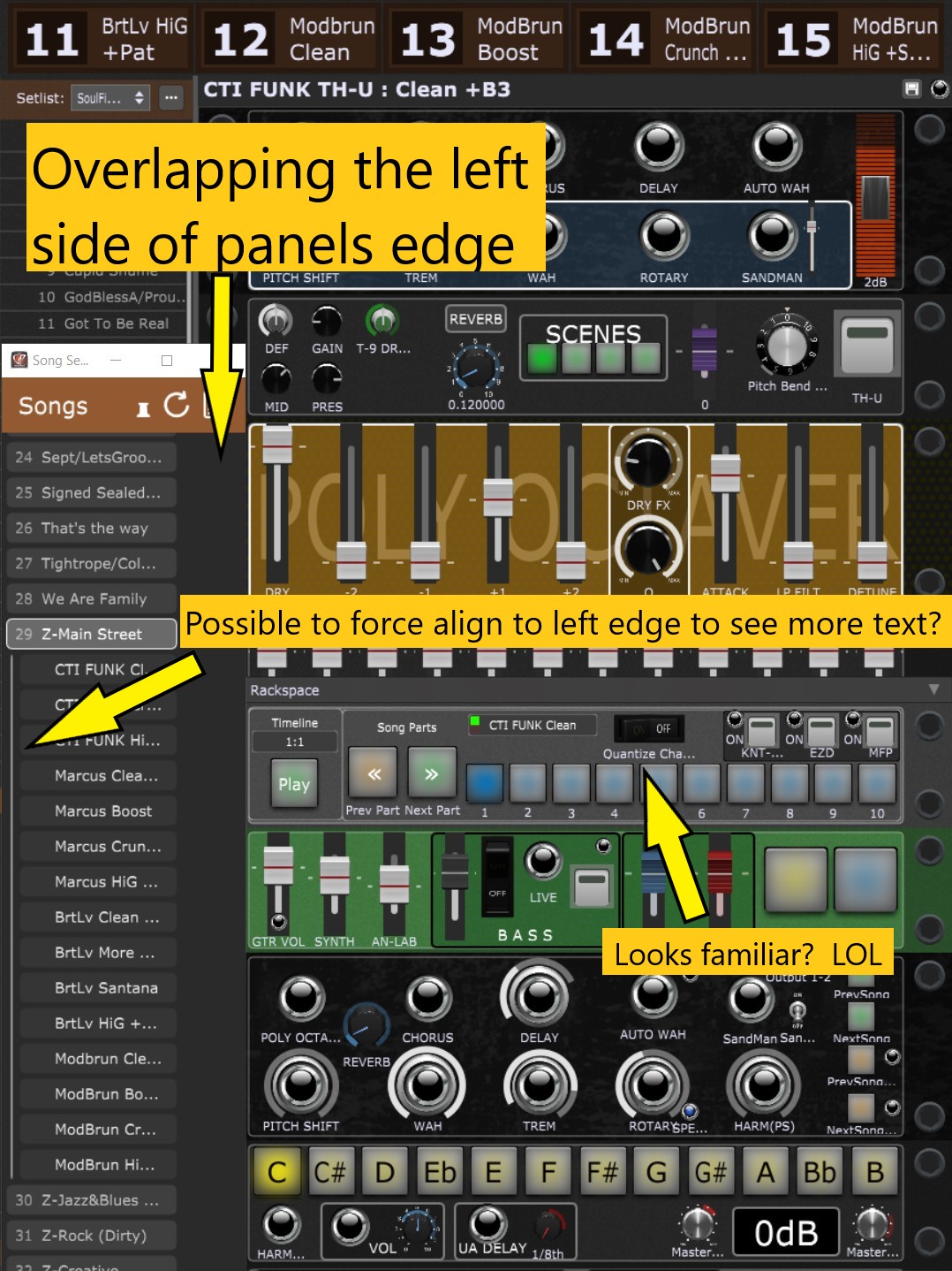
I’m trying to abbreviate as much as possible, but a lot of the song parts text is not visible at this scale. Can the text be left aligned on the song parts? Between that and perhaps a SLIGHTLY narrower scroll area might do the trick? Maybe a more condensed version of the systems font? Just thinking out loud…
This is how it looks when extended to see all the text. Its too wide… ![]()
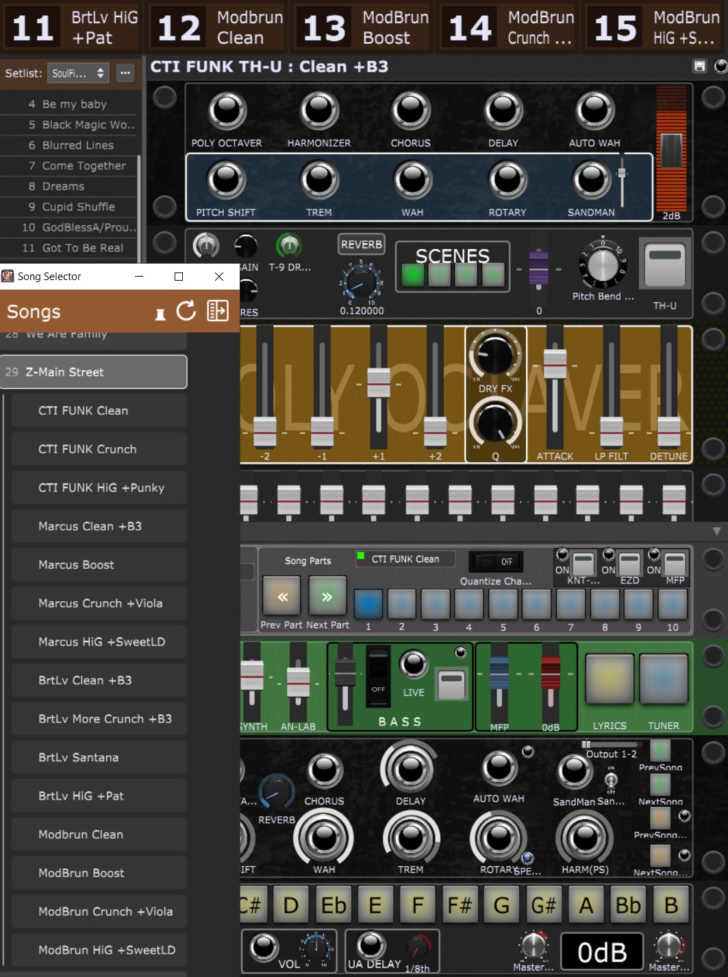
This is why I asked about color coding. I could get rid of words like “clean”, “crunch” etc… I would need 4 colors to cover most if not all. If I can get it visually and functionally useable in that left space over the song window, then I could get rid of the huge 15 song parts real estate on top. Maybe… ![]()
Thanks again!!!