Our goal is to have as few options as possible - the more options there are, the harder it is for people to understand and configure the product.
Even a thin black border might help. Or white actually, to match the white around the block.
Or changing the whole stripe to black with the white lettering, I think would surly stand out on every block.
I realize it’s a design preference though, function vs form.
With some design / UX knowledge, there are two things to consider here:
The colors shown in screenshot are extremely close both in hue and brightness.
Also depending on the settings of the screen, it is hard to distinguish these.
(actually I have 2 screens in front of me, on one I can see the difference, on the other close to impossible!)
I also like to take color blindness into consideration. Two colors with same brightness may be impossible to distinguish from each other by people with certain color blindness.
The solution to both things:
When defining color schemes, especially if these colors are to be layered, try to find different brightness levels for each.
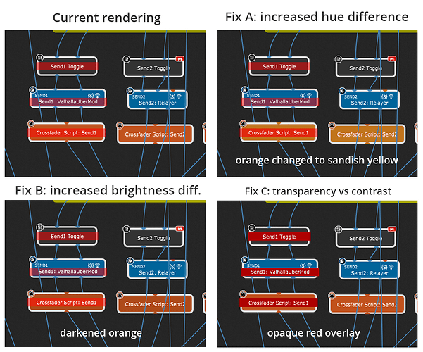
Here are some ideas to improve the situation…
You can add me to the list of people who have difficulty with the Bypass colour. My career job required color vision testing every two years to maintain my licenses. I have a slight red-green deficiency - not enough to be disqualifying - but discoverable by testing, and the Bypass color band is tough for me to see. Sounds like some others have a problem with it too.
Nice mock-up pictures above!
Of those shown, I think I like the lower right the best because, regardless of the base color of the block being bypassed, the bypass indications themselves (the horizontal “red” bars) are self-consistent and this makes it as easy as possible for the eye to see and take in the location of all off the bypassed blocks in toto.
Yes, but the red overlay will fail if we ever want to create a plugin block that is red!
Well, a rainbow of bypass colors, or a single bypass color. Sure, that’s the choice!
One could, if one wished, treat red-on-red as a singular special case and use some sort of visual inversion to deal with it. Just sayin’, not advocating.
Another thought - if we did go with Red, what if someone then says “I have a hard time seeing Red”? (same applies to any color you pick)
That’s why I personally think that even after the best creatable design, it will only be possible to really have it work for everyone if the possibility of user-specified customization somehow exists. Heck, hide it if you can’t stand it being normally visible - or put in in a textual config file that most people wouldn’t even know existed. But in the end, it is a binary choice - truly support everyone in this visual respect, or leave someone stranded.
red on red will always fail, no can do about it.
However red is well known as an “alerting” color, error messages, highlighting important things etc.
So, knowing pure red is already used for this in GP too, there are many other colors to choose ![]() (hehe, I remember one client whose whole corporate CI was screaming red. Not the easiest task if everything looks the same.)
(hehe, I remember one client whose whole corporate CI was screaming red. Not the easiest task if everything looks the same.)
IOW, best not to have red plugin blocks? (if so, I tend to agree)
“I have a hard time seeing Red” etc … a noteworthy thought, still most softwares are without capability of full color customization and it doesn’t seem like there is a huge demand for that.
About color blindness etc… some background knowledge for whoever is interested
A short refresh of knowledge: RGB - RedGreenBlue - screen pixels were built to match the frequencies perceived by human eye.
Color blindness means one of these receptor types is missing/defect, so that you can only see RG / GB / RB. In such a case, one cannot see the “missing” color attribute, so for example a pure deep red is pretty much invisible.
For that reason its smart to “tint” pure colors, instead of intense red, add a bit of blue for example. And maybe some green too, which will increase the “whiteness”.
If there ever is a good reason to have red plugin blocks, they shall be red.
But considering the current color scheme, I’d not recommend red for the sake of “looking nice”.
Addendum about color blindness:
For web development, dev tools have built in color filters available to instantly check if the color scheme works well.
There are tools that can be used with screenshots to simulate what a person with color blidnness/deficiencies can see, for example Coblis — Color Blindness Simulator – Colblindor
